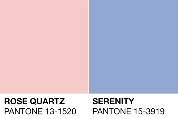
If you’ve always wondered why most releases from fashion and beauty brands this year are leaning to the pastel pink and blue trend, it’s because of Pantone’s colour of the year for 2016 are Rose Quartz and Serenity.

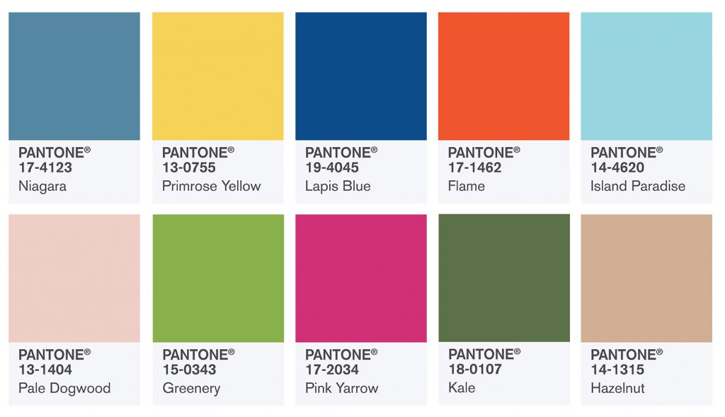
We’ll save the story on how Pantone chooses the colour of the year for another post but basically, they are the 411 to what’s the hottest colours to use in the coming year. You can take these colour inspiration for your clothes, makeup and home. So in conjunction with New York Fashion Week, Pantone has provided an overview on the colours that fashion designers have used in their Spring 2017 collections in the PANTONE Fashion Color Report.
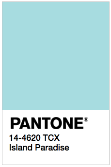
“One of the things that we saw this year, was a renewed sense of imagination in which color was appearing in context that was different than the traditional,” said Leatrice Eiseman, Executive Director of the Pantone Color Institute. “Reminiscent of the hues that surround us in nature, our Spring 2017 Fashion Color Report evokes a spectrum of emotion and feeling. From the warmth of sunny days with PANTONE 13-0755 Primrose Yellow to the invigorating feeling of breathing fresh mountain air with PANTONE 18-0107 Kale and the desire to escape to pristine waters with PANTONE 14-4620 Island Paradise, designers applied color in playful, yet thoughtful and precise combinations to fully capture the promises, hope, and transformation that we yearn for each Spring.”

We can imagine the beautiful tropical designs that are coming up using the Kale and Pink Yarrow shade! Who knew Kale would be a hit this Spring? We at Pamper.My are drawn to the Island Paradise shade because it’s similar to our theme!

But you can check out the descriptions of each of the colours at Pantone’s website to get some inspiration!
And speaking of kale, here are a few ways to get more bright-coloured Pantone inspired fruits and vegetables into your diet.
Read also: 16 Effortless-Ways to Incorporate Fruits and Vegetables into Your Daily Diets
– Cover Image: pantone.com


